
Identifying AI-Generated Imagery
The Tells: A Brief Overview
This guide is being compiled and written in the late summer of 2026. While I’ve done my best to keep the information as up-to-date as possible, the rate at which generative artificial intelligence models are developing will inevitably render some of these observations obsolete.
It feels appropriate to reiterate that all imagery generated by AI models including ChatGPT, Claude, Gemini, Grok, Midjourney, et cetera, relies on art theft. Theft from real, human artists. Theft from people who spent years working on their crafts, whose labor has been alienated, whose creations have been consumed to feed a database.
I’ve broken this guide into five sections, each general topic should lend you insights into identifying generative AI imagery whether it’s an event poster, illustration, photo, or video.
↘
Pattern Continuity
Click to enlarge images
I want to start with an image that forced me to double-take. At first glance or on a quick scroll, this doesn’t look much different than how we’re used to fast food being photographed. The pizza is a little too shiny, the cheese a little too melty- we’ve seen that for years.
One thing that generative AI tools continue to struggle to render are patterns. The models can understand that a pattern exists and repeats, but as it creates more iterations, it becomes more likely to hallucinate.
Check out the pizza slices- not even a stoned teenager at Papa John’s can slice that badly.
The box itself is less obvious at first, but what are those fold indentations in the top? Is that paper under the pizza or more cardboard? What are those shapes supposed to be?
AI
Human
AI
Human
Recognizable patterns and objects, like the paisley and the American flag shown above, aren’t easy for generative models to recreate. The more intricacies and iterations a source image has, the more likely the model is to start hallucinating, which is essentially just what it sounds like: the model gets confused and disoriented, and starts to wander.
Relation of Subject to Environment or Self
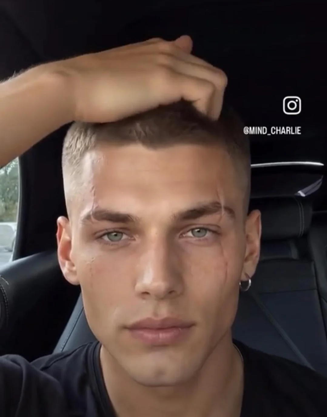
Generative AI models are learning all the time, from growing numbers of inputs and from developments made to address the flaws we were all making fun of a year ago. This video was made, presumably, in response to charges that AI deepfake tech could be outdone by waving a hand in front of the face (think of how TikTok and IG filters get thrown off when they can’t perceive your face).
This video is pretty impressive on the first watch. It ALMOST got us, he was able to wave his hand in front of the camera! The prompter missed a pretty major flaw here, though. At roughly 13 seconds into the video, when the character is running his fingers through his hair- his fingertips disappear into suddenly thicker hair.
These are the kinds of mistakes an AI model will make, because it lacks an understanding of the nuances of how a subject interacts with its environment and with itself.
Horrifying finger positioning in this Heinz ad. Bizarre tomato…ish objects inside the bottle don’t quite fit within its shape.
HOW ARE THE SLEEVES ATTACHED? What is that button distribution? Why doesn’t the mirror reflect the tree’s height?
This hyena’s jaw looks more like a pelican’s, and the way it intersects with the lion cub’s arm and body don’t make sense.
These discrepancies between the subject and environment reveal a larger issue: a fundamental misunderstanding of how physical bodies exist in space. While generative artificial intelligence models can create a likeness of something real, the images they produce degrade further and further the more details they try to incorporate. This leads us to our next big tell: anatomy & proportions.
Anatomy & Proportions
It’s Body Horror Time.

Anatomy is hard. Anyone who’s ever tried to draw knows that. Generative AI models, thankfully, still struggle with pretty much any form of it. Hands are a generally good place to look- except for how hard hands are to draw. Ask me how I know. Faces can range from uncanny-valley realish to funhouse mirror. The new Trivago ads are a great example of how terrifying a generated face can look.
The best places to look for hallucinations include:
counting limbs and how they relate to the body or others
counting fingers and toes
smaller details like number (or orientation of) fingernails, shoelaces, jewelry/body adornments
reflections and other mirrored surfaces
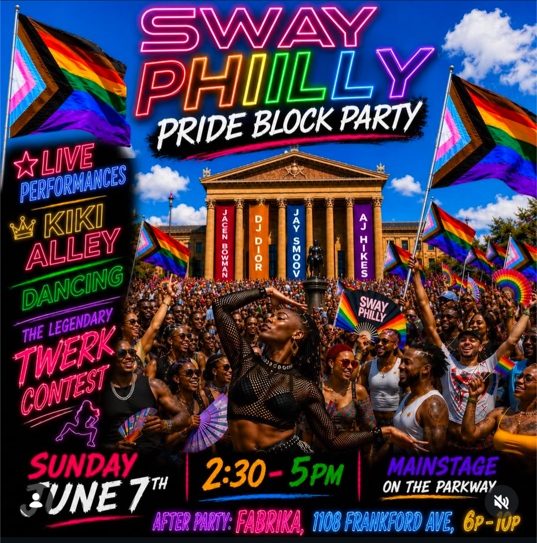
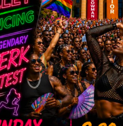
In generated images like the one above, the large crowd has a lot of examples of hallucinations. There are body horror levels of mangling to some limbs, there are duplicates of the same subject, the detail on the individuals in the crowd drops off significantly after the first few rendered figures.
Use the other tells we’ve talked about already, too. When you turn your critical eye to an image, it’ll all start to pop out faster and faster.
Artifacts
Much of what we’ve gone over so far can be referred to as artifacts. Artifacts are basically like hiccups that occur during AI image generation, from small goofs like line continuity to more noticeable issues like too many fingers or The Piss Filter. Artifacts are our best tells, especially in generated photography and illustrations. Lighting, composition, and detail are concerns for the human artist, not the generative model.
Here are some examples from prompters on Instagram, some of whom are so committed to the bit that they generate and post progress images and speedpaints to emulate legitimate artists.
Distorted car body, disjointed headlights, incomplete rims, garbled livery. The upside-down car lacks symmetry, has scratchy tire treads, and a noodly undercarriage. And what. is. that. green. triangle?
For reference, here’s the iconic Toyota Supra MK IV from the movie. This photo is from the auction of one of the eight movie-used cars in 2021, courtesy of Practical Motoring.
You can see how the generated image of the car loses all the crisp lines of the car, the text, and notably, the famous ‘nuclear gladiator’ livery designed by Troy Lee.
Here’s an example of a generated “final” image next to a “progress” image (based on this scene from Mission Impossible 3). There are a few prompters out there taking advantage of people by generating these “progress” images and speedpaint videos to legitimize themselves. And, to someone unfamiliar with digital art, the image on the right looks like a rough start to the “finished” piece on the left.
There’s an intentional busy-ness to the image as a whole: your eye is pulled all over to distract you from the more glaring mistakes. You may not notice the random wrinkling and textures on the jacket, the multiple light sources, the incorrect depth of field, the strange-shaped fingers, and the nonsensical artifacts scattered around the central explosion— there’s purposefully too much to look at.
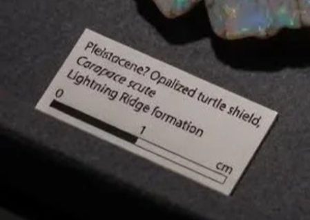
This photo popped up in one of my niche hobby communities: a stunning-at-first image of what appears to be a fully opalized turtle carapace. This would be an incredibly rare occurrence, and an exceedingly rare animal to fossilize this way in such a (relatively) short time period. The fossil enthusiast would be critical immediately, but the casual enjoyer would see something epic.
One big oversight, though: the text on the identification label. It’s visibly warped, almost obscuring the main points of information: that’s supposed to say ‘Pleistocene,’ and the accurate identification for this type of fossil would be a carapace (or shell).
Additionally, a scute is an individual portion of the shell, so that’s just blatantly incorrect. But don’t get me started on that…
We’ll close this section with one of the more blatant and messy uses of generative AI to emulate human illustrations. This one’s got a bit of everything: inconsistent patterns, different numbers of fingers and toes, strange proportions and depth of field, inorganic shapes in the trees, and a whole lot of artifacts. Oh, yeah, and TWO MOONS!
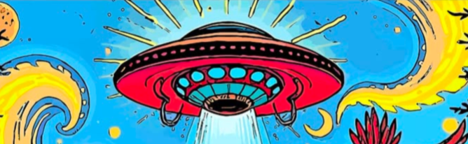
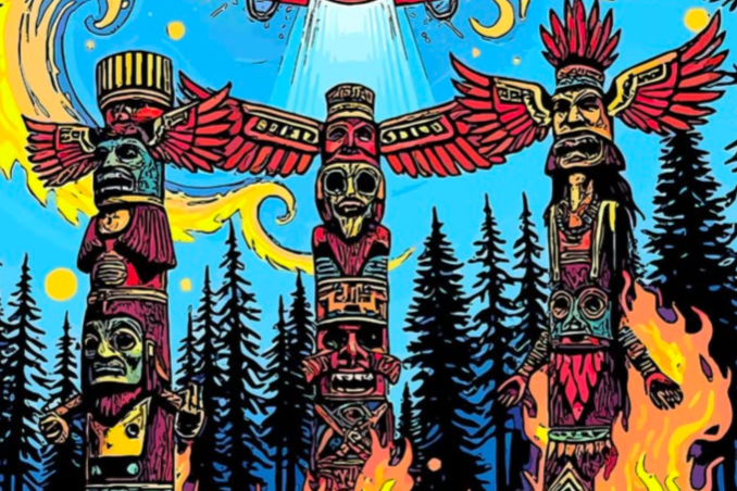
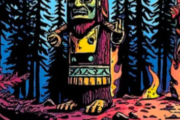
What makes this one a bit extra insidious is that it aims to replicate a folk and alternative art style that’s intentionally human. Art done in this style, often for band tours or festivals, isn’t expected to be perfect- it’s expected to show the stylistic qualities of the artist who made it. Removing the artist from the process of art results in uninspired slop like this. It’s nothing more than a regurgitation.
Speaking of nauseating…
Popular Prompts & Templates
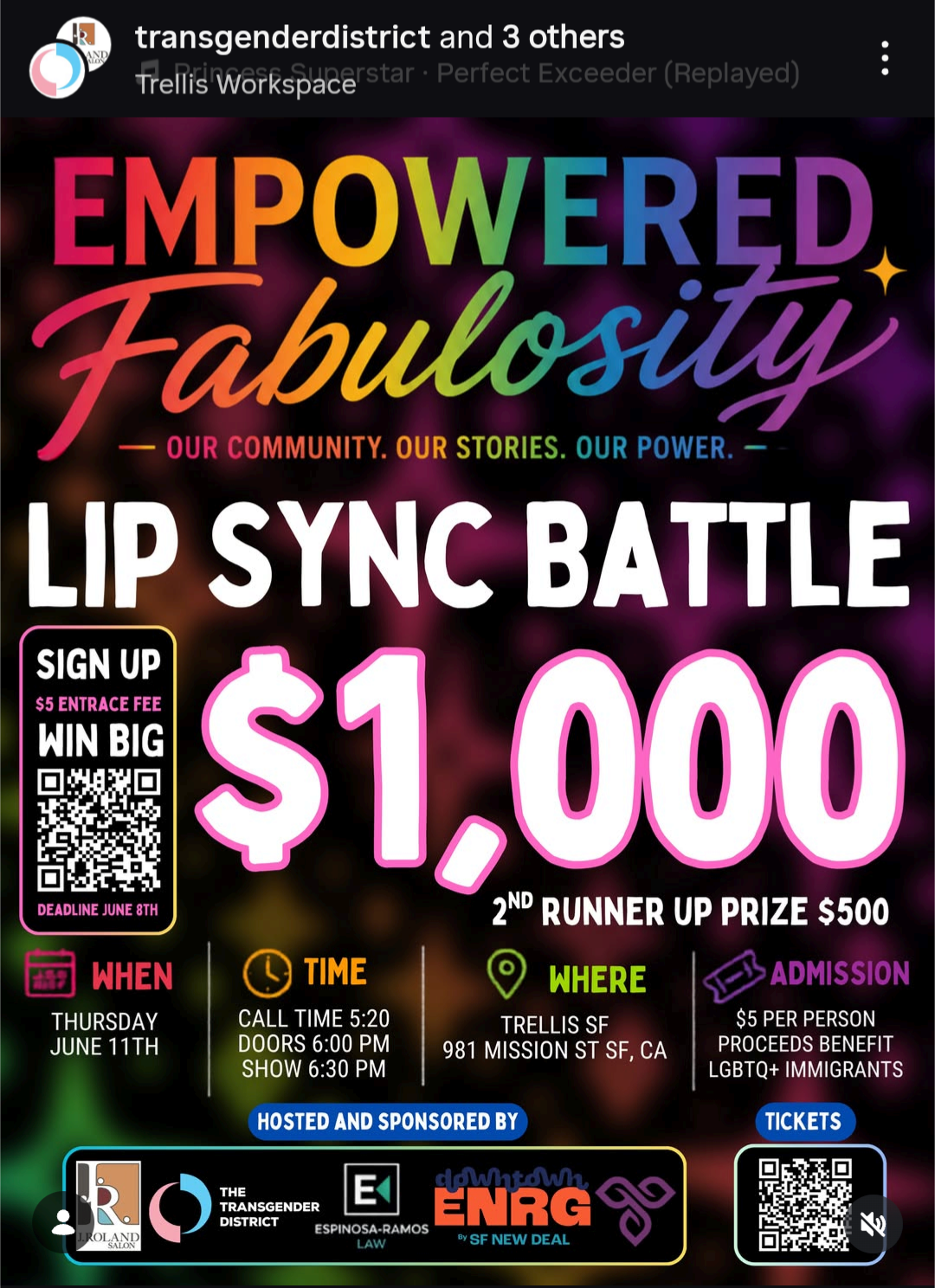
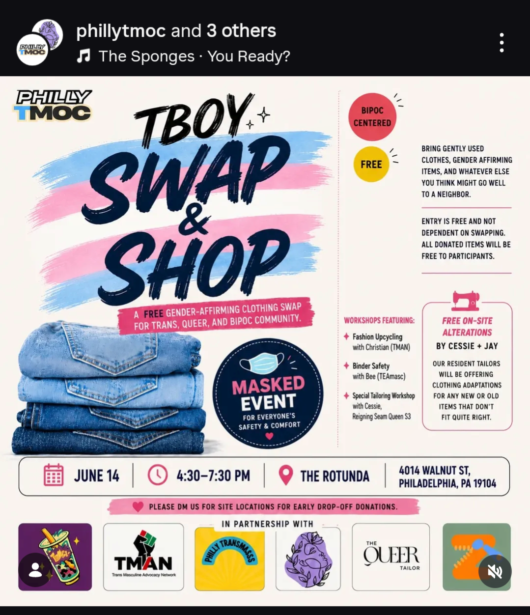
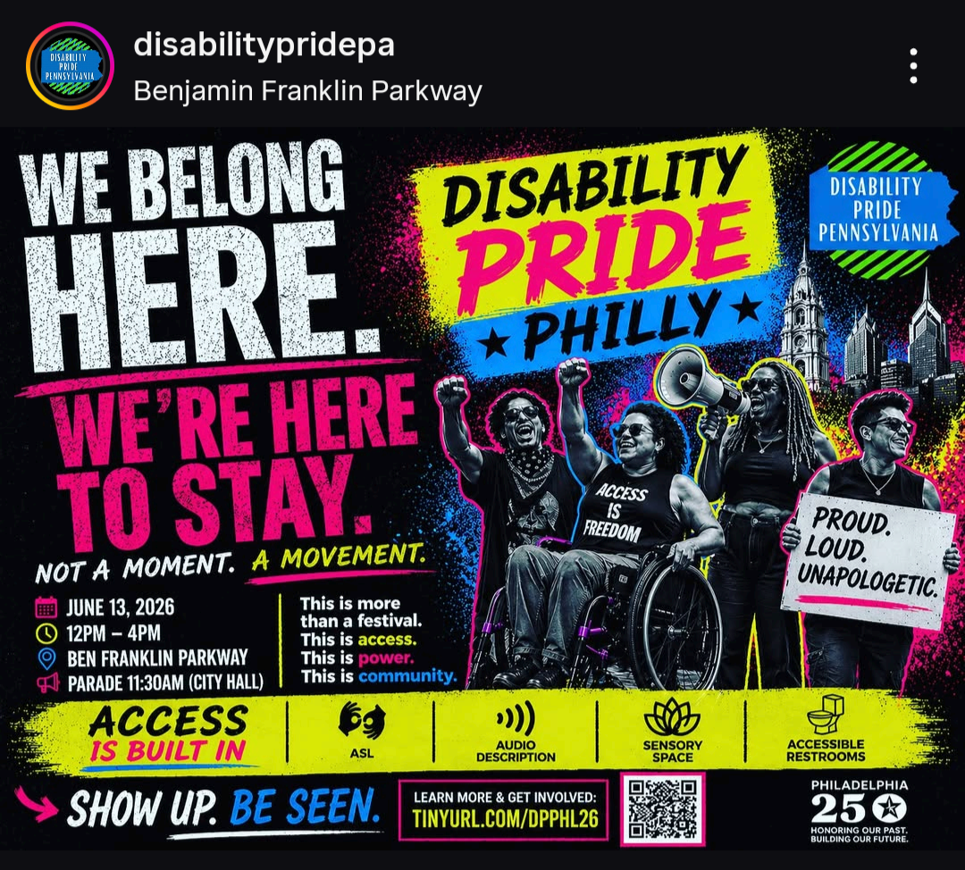
It’s impossible to have missed this flier in some form this summer. 404 Media has a fantastic article about this, We Are Living in a ‘ChatGPT Flyer Pandemic,’ I highly recommend reading it!
This “infographic” style flier format was a popular prompt and as you can see from the examples below, the output is based on existing fliers but fails to replicate one of the basic tenets of this graphic’s format and purpose: legibility.
You can see how egregiously small some of the text is generated: too small to function. An infographic not only needs to communicate information, it needs to be readable and accessible.
The brush-style fonts are part of the template and became more than a little repetitive in social media feeds, but it’s especially grotesque when you look at a group of them together:



Where Do We Go from Here?
The insufferable bros driving this tech aren’t wrong: there’s an inevitability to artificial intelligence. Gamers, researchers, and other communities know that AI has existed in many forms for decades already. Enemy NPCs in video games are programmed with artificial intelligence, large language models (LLMs) are used to categorize information and form databases. All these uses are helpful, they push science and society forward.
Generative AI models contribute nothing meaningful in comparison. What we’re looking at is a degradation of art, of human pursuits, of the innate curiosity and urge to create that each of us has inside. Art is about the making. The intent. The feeling.
Nothing can replicate that, and nothing ever will. An image spat out by a machine trained on the existing art of innumerable artists will never have the impact of a human-made piece.
As we march on toward an uncertain but definitely-not-cyberpunk future, it falls to us to stop feeding these models voluntarily. Your data is your currency, your identity is market fodder, and you’re already under surveillance. Resistance is necessary.
Below, I’ve included some further reading and resources. Watermarks are increasingly unreliable, so synthID checks tend to yield the best results: note that each site only searches for its own watermarks, so you may have to try multiple platforms (i.e., Gemini will only identify Gemini, OpenAI will only identify OpenAI). Tools like Nightshade and Glaze are designed for artists: they ‘poison’ the artist’s work so that it can’t be scraped by generative models when it’s uploaded online. We can fight and we can win.
Further Reading + Resources
News & Media